Owen Clarke
College Magazine – Evaluation
The college magazine front cover and contents page I have created is aimed at Wyke College students who have an interest in football. My target audience consists of students aged 16-19, mainly males. I used Photoshop to manipulate my images and text, and then added all the features onto Publisher to build up the front cover. To create the contents page, I used Publisher. In addition to this, I used Blogger to post all my planning onto which proved to be a benefit for me.
I used several different colours on my front cover. The main being purple as it represents Wyke College and the football shirt being worn on the image. I also used black, gold and red as I feel these colours are powerful and stand out very well on the white and purple background. The conotational meaning of gold is that it represents fame and something which is excellent. That is the message I am trying to provide to the audience about the player shown on the main image. The masthead is very bold and stretches from one side of the page to another. It seems to dominate the front cover, instantly attracting the audience targeted. I used a medium-close up camera shot for the main image. It is fairly large and covers a lot of the front cover. The image is overlapped by one piece of text so that the audience can relate the two. The person shown has his arms crossed and he looks very serious. It gives the audience the idea that he is very determined about something, the most obvious in this case being football. Furthermore, we can see by looking at the expression that football may be very meaningful to him or of fundamental importance. I looked at several FourFourTwo magazines which highlight football across the world and I can see that the front covers are jam-packed with information about content inside the magazine. I tried to represent that slightly by adding quite a few sub-content titles. I also kept the layout simple and clear to the audience which makes it therefore bold along with the colours used. After looking at several other magazines, a lot of them position the key features in similar places around the front cover such as the masthead and main image. I included snowflakes due to the date written on the magazine. I believe many magazines include representative features on their magazines, the main being what type of season or popular occasion is upcoming, such as Christmas. I did not include a barcode on my magazine as it is free to attract more people to get one. Furthermore, not many college or school magazines are not free; otherwise I think it would put people of buying one.
Overall, I believe I learnt several different new techniques while creating my magazine front cover. I feel like my magazine front cover went to plan, and I boldly highlighted the key factors that I wanted to include. I think there are also some negative aspects to my magazine front cover. I feel like I could have taken a few more images to add to the cover. In addition to this, I feel I could have manipulated certain parts of the cover on Photoshop to a better standard.


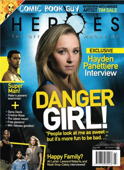
 A popular camera angle used for many magazine covers is the medium close up shot. The front cover on the left shows this. A lot of the time, when magazines use the medium close up shot, the person in the image looks at the camera, creating a direct effect towards to buyer.