
17 December 2009
14 December 2009
Colour Scheme
From look at several magazine front covers. I can see that a lot of music magazine covers used red and black as their main colours. A lot of the time they add a lighter colours such as white to either vary the colour scheme, or lighten up the page. I need to take the colours used by other famous music magazines into consideration when producing my front cover. By doing this I have made the background red and the text black. I have included a lighter colour when putting a white outer glow on parts of the text. Some examples of covers that use the above colour scheme are: 


After creating (what up to now is my final product) I have used the idea of red black and white colour scheme in my magazine but also included blue. This is because my main story is about an English Rapper trying to succeed and claim his American Dream. Therefore the black white red and blue colour scheme represents that of the USA and UK flag and also they all stant out on each other and go well together.
After creating (what up to now is my final product) I have used the idea of red black and white colour scheme in my magazine but also included blue. This is because my main story is about an English Rapper trying to succeed and claim his American Dream. Therefore the black white red and blue colour scheme represents that of the USA and UK flag and also they all stant out on each other and go well together.
23 November 2009
Conventions of VIBE Magazine

Language - The main colours on this edition of 'VIBE' magazine are red, black, white and grey. The red stands out easily on the white and grey background therefore attracting the audience to look at it. The masthead is covered partly by the main image. For this magazine, it is not a necessity to show the complete masthead as the audience will know the magazine anyway.
The font size of the sub-content titles varies around the front cover. The largest being the masthead so that it stands out.
Ideology - 'American Beauty Keyshia Cole' is written next to the image. The image of Keyshia Cole looks airbrushed so that it represents beauty which relates to the text written next to it.
Institution - VIBE is a magazine that gives the audience information about the latest music and artists. It also has a website and is commercial. Their aim is to make money through advertisement and magazine sales.
Audience - VIBE magazine looks as if it is aimed at an age range of about 16 - 30. It may be aimed at both males and females because the image looks as if it is aimed at males however, the sub content titles are quite feminine such as, 'celeb secret santa'.
Representation - The main part of this magazine that represents something is the image. It represents how we see beauty in the real world. Furthermore, the colours used on the text relates to christmas which is a theme of the magazine. This is what the colour represents.
20 November 2009

11 November 2009
Conventions of a music magazine (NME)

Masthead - The masthead is overlapped by the main image of Lily Allen. NME magazine does not need to make the masthead completely clear as it is a well known and popular magazine. However, the parts of the masthead we can see, is very clear with a bold font and colour. It doesn't spread from one side to the other unlike other magazines.
Main Image - The main image is captured in relation to the sub-content titled next to the image. It portrays 'Lily Allen' as very pale and zombie-looking which relates to the title, "I can't keep on living like this, it's doing my head in" and "TAKES ON THE WORLD".
The date and price is written just under the left hand side of the title. It is written in a small font but it is usually relevant to the buyer so it is easy to find on the front cover. The barcode is only needed when purchasing the magazine and it is situated on the bottom right hand side of the cover. It is easy to find for the person selling the magazine.
Institution - NME magazine is a very popular and well-known music magazine. It also has a website and TV channel. Its purpose is to inform and entertain the readers and viewers of NME and to make money. The magazine and website contains reviews to provide info about celebrities and music. The TV channel contains adverts and the content is mainly entertainment.
Ideology - I think that by using the text used next to Lily Allen on the cover, NME might want to convey the image that she is famous and she is known worldwide, therefore 'taking on the world'. The image reflects off this by her looking as if she is exhausted and kind of fed up.
Audience - The audience of a magazine like this can vary depending on who is on the front cover. For example, if i saw this magazine with a band such as Paramore on the front, I probably wouldn't buy it. However, if someone such as Cheryl Cole or Kanye West was on the cover, I would buy it. I think this magazine can be aimed at a wide range of audience, possibly both males and females aged, 13-30.
10 November 2009
Conventions of a Music Magazine
Main Image - The camera shot of the main image can range from a close-up to a long shot. From looking at several music magazines, the camera shot of the main image can depend on whether a band is being shown or just a single artist. For example, in 'Hip-Hop Connection'magazine, A close-up image of Lil Wayne is shown. However, in 'Q'magazine, a medium shot of Coldplay is shown. The main image on the music magazine front cover is usually a well-known artist or band that will attract the audience to buy it because of the content relating to the image.
Sub Content - There is quite a lot of writing on the front cover of a music magazine. The text includes many names of bands and artists attracting the audience targeted. Furthermore, there's also text relating to the sub-content titled such as a quote from an interview, or attracting information which tempts the buyer further to purchase the magazine. The sub-content that is undoubtedly on every front cover of a music magazine is the names of popular and famous artists. If a reader likes the artist listed, they may buy the magazine.
Sub Content - There is quite a lot of writing on the front cover of a music magazine. The text includes many names of bands and artists attracting the audience targeted. Furthermore, there's also text relating to the sub-content titled such as a quote from an interview, or attracting information which tempts the buyer further to purchase the magazine. The sub-content that is undoubtedly on every front cover of a music magazine is the names of popular and famous artists. If a reader likes the artist listed, they may buy the magazine.
9 November 2009
LIIAR
Language (Magazine Terminology)
- Masthead - This is usually quite large on the front cover. If it is a well - known magazine, it may be overlapped by the main image such as Four Four Two. It identifys the magazine and sometimes tells us what the magazine is about. However, if we did not know 'Q' magazine is a music magazine, we would not be able to tell by the masthead.
- Dateline - This is not usually relevant to the buyer of the magazine on the front cover. It is added in small text sometimes; under the masthead, next to the barcode, in the top hand corner of the cover.
- Content - Usually spread around the front cover around the image in different sizes or fonts depending on genre and style of magazine.
- Main Image - This represents the main story in the magazine and is sometimes manipulated or props included depending on what the magazine editors want to connotate.
- Colour Scheme - Either kept similar through each edition of the magazine to represent the magazine or changed in relation to what the magazine is connotating, for example - a lot of black on the cover would represent a gothic style.
Institution
- Create media texts - Such as the BBC
- Control language
Ideology (Ideas, Values, Beliefs)
- The values that the media text conveys - the ideas and beliefs of an image of someone who looks unhappy with a weapon would convey the image that they are dangerous.
Audience - can be classified as:
- age - range of ...
- wealth - how much money they have.
- occupation - type of job
- interests - possibly what kind of music they enjoy listening to etc
- groups - type of group they belong to such as 'chav'
Representations (how are groups/issues/individuals portrayed?)
- Representations convey on ideology - above^
6 November 2009
Presentation of my Work
The presentation of the research, planning and evaluation may take the form of any one, or combination of two or more, of the following:
-A presentation using slideshow software such as powerpoint
-A blog
-A podcast
-A presentation using slideshow software such as powerpoint
-A blog
-A podcast
Brief Main Task
Main Task: The front page, contents and double page spread of a new music magazine. All images and text used must be original, produced by me, minimum of four images.
23 October 2009
Front Cover Evaluation
Owen Clarke
College Magazine – Evaluation
The college magazine front cover and contents page I have created is aimed at Wyke College students who have an interest in football. My target audience consists of students aged 16-19, mainly males. I used Photoshop to manipulate my images and text, and then added all the features onto Publisher to build up the front cover. To create the contents page, I used Publisher. In addition to this, I used Blogger to post all my planning onto which proved to be a benefit for me.
I used several different colours on my front cover. The main being purple as it represents Wyke College and the football shirt being worn on the image. I also used black, gold and red as I feel these colours are powerful and stand out very well on the white and purple background. The conotational meaning of gold is that it represents fame and something which is excellent. That is the message I am trying to provide to the audience about the player shown on the main image. The masthead is very bold and stretches from one side of the page to another. It seems to dominate the front cover, instantly attracting the audience targeted. I used a medium-close up camera shot for the main image. It is fairly large and covers a lot of the front cover. The image is overlapped by one piece of text so that the audience can relate the two. The person shown has his arms crossed and he looks very serious. It gives the audience the idea that he is very determined about something, the most obvious in this case being football. Furthermore, we can see by looking at the expression that football may be very meaningful to him or of fundamental importance. I looked at several FourFourTwo magazines which highlight football across the world and I can see that the front covers are jam-packed with information about content inside the magazine. I tried to represent that slightly by adding quite a few sub-content titles. I also kept the layout simple and clear to the audience which makes it therefore bold along with the colours used. After looking at several other magazines, a lot of them position the key features in similar places around the front cover such as the masthead and main image. I included snowflakes due to the date written on the magazine. I believe many magazines include representative features on their magazines, the main being what type of season or popular occasion is upcoming, such as Christmas. I did not include a barcode on my magazine as it is free to attract more people to get one. Furthermore, not many college or school magazines are not free; otherwise I think it would put people of buying one.
Overall, I believe I learnt several different new techniques while creating my magazine front cover. I feel like my magazine front cover went to plan, and I boldly highlighted the key factors that I wanted to include. I think there are also some negative aspects to my magazine front cover. I feel like I could have taken a few more images to add to the cover. In addition to this, I feel I could have manipulated certain parts of the cover on Photoshop to a better standard.


18 October 2009
Beloit College Magazine

This college magazine has quite a simple front cover. The layout and colours are not complex. The masthead is written in a simple white font which makes it clear to the audience and stands out on the grey background.
The main image covers the full front cover as the background and is overlapped by several sub contents which are also written in simple white font.
The main image suggests that this magazine could be about science or that it might just be related to the main content included.
I think that by looking at this front cover, the magazine would be targeted at ages, 16-19 and maybe college students interested in science or taking science as a subject.
There is no barcode on the front which suggest that this magazine may be free.
The date is written in small font under the title although does not have the day or date, it is just the month and year. This may be because the producer of this magazine sees the day and date as irrelevant because of it being an internal college magazine.
16 October 2009
LIIAR
 LIIAR of Heroes Magazine
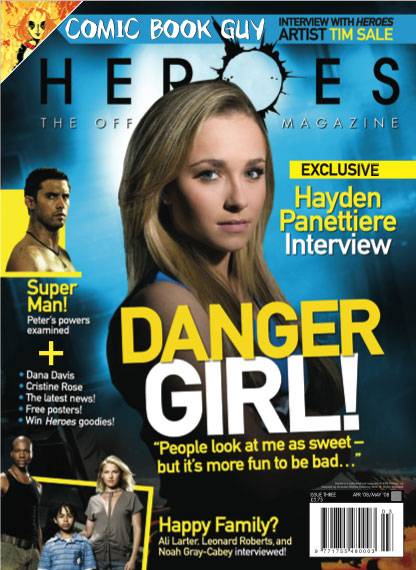
Language - The masthead in this magazine has a very simple font excluding the "O" which is more complex. The way this letter is on the front cover will be a representative of part the program which maybe why it is used in the name. It makes the simple font of the masthead quite interesting and different in a way.
The image used on the front cover is a medium camera shot. The way the woman is stood on the image creates the idea that she may be in charge. She is striking a predominant woman kind of pose to the camera. Her facial expression is very serious although there seems to be a slight smile. I believe Hayden Panettiere looks as if she is very dominant and there is no one more superior than herself.
Institution - "HEROES" magazine was made to represent the program "Heroes" produced by the BBC. Titan Magazines released the first issue of "Heroes" magazine on November 20, 2007.
Ideology - The ideology behind this magazine is to provide the audience they target with interviews, news, stories, further info etc relating to the actual BBC program, "Heroes". Rather than just being 100% fictional like the program itself, this magazine also provides the audience with real-life aspects, such as the Hayden Panettiere interview.
Audience - The audience of this magazine is mainly the viewers who watch the program on BBC and are eager to find out more about what is going on. I believe that this magazine is targeted at both males and females, aged around 15-30 years old. I only think this because I have watched the program personally and know what it is about. If I hadn't of watched the program and judging by the magazine front cover i would come to a conclusion that it is targeted at both genders aged 11-16. This would be because of the colours used such as the yellow and blue. Plus, the sub content titled at the top of the cover saying, "COMIC BOOK GUY" would in my eyes, relate to comics read by younger teenagers.
Representation - The magazine is produced to promote and inform the audience targeted about the television programme, "Heroes". This magazine may reflect stereotypes in the audience because of the genre of magazine.
Camera Angles
 A popular camera angle used for many magazine covers is the medium close up shot. The front cover on the left shows this. A lot of the time, when magazines use the medium close up shot, the person in the image looks at the camera, creating a direct effect towards to buyer.
I believe magazines use this type of camera angle so that the buyer is attracted to the magazine because of who they see on the front cover. For example, if Cheryl Cole is pictured on the front of a women's magazine, a lot of women may go take a look because of what the magazine may be revealing about Cheryl Cole.
I think that when magazines use a medium close up shot, they are purely trying to capture the audience's attention because of the person on the cover rather than what other magazines may be trying to advertise such as, clothing, products, etc.
15 October 2009
Typography
Typography is the appearance and style of arranging type. Typography was originally the use of metal types in letter form that were pressed with ink onto paper. In the modern day, it is how and what we select our font to be like such as the size, style and overall appearance.
Display typography encompasses:
- Posters; book covers;
- Typographic logos and word marks; billboards;
- Packaging and labelling; on-product typography; calligraphy;
- Graffiti; inscriptional and architectural lettering;
- Poster design and other large scale lettering signage;
- Business communications and promotional collateral; advertising;
- Word marks and typographic logos (logotypes),
- Kinetic typography in motion pictures and television; vending machine displays; online and computer screen displays.
Barcode
 The barcode is an optical machine readable representation of data and is needed on the magazine so that the buyer can purchase it.
Few magazines have the barcode on the top of the magazine front cover or close to the title. In the example to the left, the barcode is positioned on the bottom left hand side, out of the way of important sub content titled on the front cover. This is the position for the barcode used by many magazines.
The barcode seems an irrelevant aspect on any magazine that you buy because it is purely for the retailers use. Therefore, we could question, why it is placed on the front cover rather than inside, out of the way? This is because the shop assistant selling the magazine needs to quickly scan the item rather than flicking through pages to look for the barcode.
Labelled Front Cover
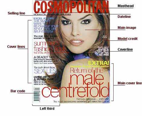
This magazine front cover helps me to know what should be included in my magazine. It labels each main aspect of the magazine which is important.
12 October 2009
Target Audience - FourFourTwo and Match Magazine

The magazine I am going to create is a college magazine so therefore I am aiming it at those at college, aged 16-18 mainly but also for teachers who maybe enjoy wanting to know what's going on in the college.
The target audience is judged by the content of the magazine. For example, Match magazine is a football magazine aimed at younger children around ages 7-12. However FourFourTwo is also a football magazine but it is aimed at teenagers and adults. I can see this because of the text, font size, colours and pictures.
Match magazine has a quite a few colours on the front page. The font seems quite animated and there are a lot of pictures, some overlapping. There isn't that much text compared to other magazines.
 FourFourTwo magazine has many different colours on the front cover. The red stands out on the grey background and unlike Match magazine; there are few images but a lot of text. The title font is simple but varies around the page. The main image covers part of the title maybe because of the popularity of the magazine the title does not need to be clear unlike a college magazine which may not be seen before by some people.
The images on Match Magazine all show players playing football which is what the magazine's theme is about. However, in FourFourTwo, the main image does not show someone playing football. I think that this may be to do with the age's targeted by the magazine.
What is needed for further research?
- A video and discuss it
- Target Audience of your magazine and another
- Camera angles, close ups?
- Style of text, font, what type is used on a college magazine
- Conventions
- Go into detail
- Typography - The art form of text
- College Magazine
- Background colour - colour in general
- Language used
- Pictures used
- Barcode
9 October 2009
ZOO

Zoo is an example of a magazine which has a lot of pictures on the front cover. This is very different compared to the single picture on 442.
In Zoo magazine, there is usually only one main content title and it is written largely on the cover to grab the buyer's attention.
The title of the magazine is red on a white background just like on the 442 magazine. This shows that it may be a popular colour to have as your writing when creating a magazine. The pictures used on the magazine, persuade the audience to buy it. In this magazine the audience is men, aged around 16-30. This magazine's front cover is packed with lots of pictures, large writing and bold items. These are all included in a men's magazine and differ from 442.
FourFourTwo
 This magazine front cover has quite a lot of writing on it. This can benefit the look of the magazine so that it isn't plain and boring and also the buyer can look what is it the magazine without flicking through first.
 The colours used all stand out on each other with the black red and white.
The red catches the reader's eye and the way the man pictured seems to be looking at the reader.
FourFourTwo have also made the writing of the title smaller than the main headline.
This attracts the reader from the title to the headline so that they want to find out more.
The magazine cover holds a very simple colour scheme although I believe the red on white is effective.
Photoshop Tutorial - Magazine Covers
Photoshop Tutorial - Magazine Covers
http://www.youtube.com/watch?v=W6WJWJpWACE
This video shows me how to take one image and put it onto another, in this case, the Grinch on top of TIME magazine in replace for Barack Obama. The video is off Youtube and as well as showing how to do this, the person also tells us. I think that this video will help me to create a magazine because I can use this when drafting to see what looks good or bad for my magazine.
18/10/09
I have used this tutorial to help me draft a few ideas out for my magazine cover.
28 September 2009
Conventions of a contents page
The contents page usually has a bold title to show the audience whats on the page.
It also has:
It also has:
- Page numbers to show what contents are on what page so that readers can quickly turn to what they want to read.
- Pictures to show what's on some pages to draw the readers in.
- Subscriptions - To attract the audience to the offers in that magazine.
- Regulars - The parts of the magazine that are in every week such as an agony aunt.
- Simple layout - Because all the reader wants to do is look what's included in the magazine without confusion.
- Author's introduction letter - A text from the writer to the reader explaining certain things and thanking the reader some times.
Conventions of a magazine front cover
The conventions of a magazine:
- Big bold title - Tells the audience what its called, what type of magazine it is. Title must be easily recognisable.
- Date - Usually in small print in the corner of the magazine or under the title.
- Pictures - Main picture to go with main subject, 1 small picture somewhere else on the cover to go with a sub content.
- Sub content titles - Seem to be grouped together on part of the front cover, a picture may accompany.
- Main content - Includes a large image, the main focus when you look at the magazine, makes you want to buy it.
- Colours - Show what is included in the magazine or the type of magazine. For example, dark colours are usually on a gaming magazine, bright colours on a tv magazine.
- Barcode - The barcode is usually placed in the bottom left hand side of the magazine front cover.
Details of coursework
Preliminary exercise: using DTP and an image manipulation program, produce the front page of a new school/college magazine, featuring a photograph of a student in medium close up plus some appropriately laid-out text and a masthead. Additionally you must produce a mock-up of the layout of the contents page to demonstrate their grasp of DTP.
Main Task: the front page, contents and double page spread of a new music magazine. All images and text used must be original, produced by you - minimum of four images.
Main Task: the front page, contents and double page spread of a new music magazine. All images and text used must be original, produced by you - minimum of four images.
Subscribe to:
Comments (Atom)